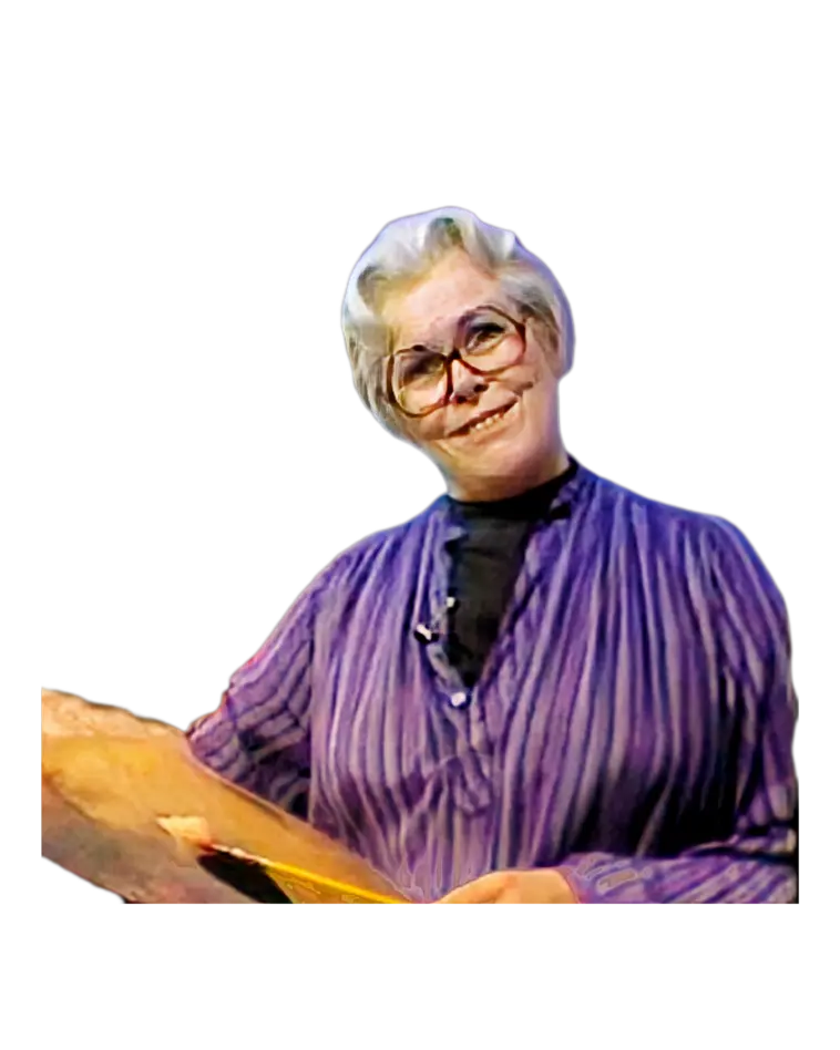
Hello, I'm Helen Van Wyk, and welcome to my studio. As you know, I'm a teacher. I'm also a painter,
so I'm two people. I have to talk to you and tell you all the things that are so wonderful about
painting, and yet, as a painter, I'm really kind of secretive. But I'm going to let you in on my
secrets today, and one of the secrets that I have is that I really use dark backgrounds a lot. Why?
Because it's easier. Notice my still life. I'm going to paint silver with red roses, and the black
background—off black—is going to show off those colors nicely and a little easier for me. Notice I
used a dark background on these flowers. This dark background is aiding, is helping, this pictorial
presentation. And that's what still life is all about. It's a pictorial presentation of a mood. Let
me see if I can put that mood on this little canvas. It isn't very big, by the way, and my first job
is to think about its size and how big I can make the subject on it. So, why don't I place it first
and see if I can make it fit? I do want to show the cloth hanging off of the table, and so that's
going to be the lowest thing. I like that rose hanging off and then this rose over here. We're
really taught not to paint even numbers—2, 4, 6, 8. We're supposed to deal with the more elegant and
natural golden proportion of 1 to 3 to 5 to 8. And I'll tell you about that someday, but right now
I'm kind of busy. So, I think I'll be able to get away with four roses by the fact that I have one
here and three there. So I have one to three. Don't let your picture happen accidentally. Think out.
Be intrigued with the whole process to justify the process and say, "Well, this is what I think
looks nice." And so this makes your picture creative, and it makes it yours. It makes it original.
We learn all the rules, as I've said before, so that we can take some license with them because we
know just how far we can deviate away from the security of the rules. And the rules, by the way,
come to us from nature. Nature has a pattern, and we just have to capitulate to it. It's a wonderful
pattern. Can't fool with Mother Nature. Now let's start in a very direct, bold way and lay in the
masses of color: dark, medium red, and off-white. And I'm going to do that all in tones that are
darker than I really see them so that I have a foundation, so I can sneak up on the light. Well,
that's not even showing; that shouldn't—it doesn't show enough either. Oh, that's better. And you
can see, instead of starting approaching this as a drawing, I'm approaching it as a painting,
starting with the putting in the tone of the silver by painting stuff running from the inside out to
make an edge. How can that brush make a line? You draw a drawing, but you paint a painting. They are
two different actions. I think that spout looks very English. Very English. Looks Tudor. I don't
know why. I don't even know whether this thing is English. I found it in an antique store. I don't
use it. Our house is full of stuff because I'm a still life painter. I have a philosophy: if I dust
one thing, I have to dust it all, so I don't dust that often. Yes, twice a year, whether it needs it
or not. And then this flower, and maybe—I think, uh, what do you think, everyone? Do you think it
would be nice to group them together a little? I think so. I'm going to have this touch, maybe not
that one. You can see that they're artificial, and they're all exactly alike. So, I'm going to take
the poetic license of changing them. I wish that the phrase "poetic license"—well, it's used to
describe making a change for the sake of the picture—I wish it were not as flamboyant a phrase.
"Poetic license" would rather have the phrase describe the practicality of it more. And then this is
going to be a cast shadow and a cast shadow. And all these cast shadows set the subject down. Here,
with a nice big brush, I'm going to suggest the light cloth. It's not just that funny old towel.
It's a light cloth that maybe will look like linen. Ooh, really, I find that that's a much too—a
value to start with—that would be better. And this is the down plane, the part that's hanging down,
and this is the top plane. Two different directions of stroke: this down, and this across. But more
importantly, two different tones because the light, this wonderful light that's coming from my
window flashing over on it, from the right, is coming from above. Hallelujah, as usual. And so, top
planes are lighter than up and down planes. This is down here, is going to suggest the table that is
still showing. And while I have that nice big brush in my hand, I'm going to lay in the dark
background. Beginnings of paintings look like beginnings. They're the start of this wonderful
adventure of trying to turn it into something. Also, right from the start, to make the composition a
little nicer. Composition is so important. It's the mold. You never really get a magnificent statue
from a poor mold. It's its heart. And so, I want to include this little fold. I can't stress enough
how important it is to start dark because going lighter is easier. Going lighter means going thicker
because white makes all these paints cover better. So, if you start dark, you go lighter and lighter
and thicker and thicker automatically. There are art books that say you have to keep your darks thin
and your lights thick. Well, you don't have to do it. It's going to automatically get that way if
you approach oil painting the academic way. And that is that you start darker and come to the light.
So, let me start lightening the silver, and I'm going to make the highlight first. I always find
that metals are almost better painted after you get the general overall shape to start right with
the highlight. And these highlights start to present, in a pictorial way, the anatomy made up of
each element. So I had one, two, three, four elements already of the knob. Inspect your subjects
from the top down so that you can ...appreciate each part of its shape and make a painted rendition
of that shape. So I see, oh, one, two, three, four, five, six, seven, eight. I have one, two, three,
four, five, six, seven, eight parts of that silver’s shape. Its basic shape, of course. The handle
and its spout are additions. I think the guy who made it did it that way too. I think, too, that you
see a lot more shines on it than I do. I see them too, but I'm only painting in the ones that I know
are going to expose the solidity, and that’s the highlights. Why don't I suggest a little bit more?
Your brush strokes look and memorize a whole form. Transfer that memory of the form to a brush
stroke because the brush is your painting's handwriting. I'm editorializing on this. With more time,
my strokes would—I'd be looking at the same things but doing each thing a little bit more carefully,
a lot more carefully. Don't let my programs and our meetings together mislead you. Don't get to your
easel and say you have to go as fast as I do. Take your own pace, but don't linger either. Figure
out a way to do it, and just then do it. Don't be afraid. Don't think you've got to make it
wonderful. Just make it the best you can. That’s all you can do. So that starts the feeling of
silver. Let me start the feeling of the anatomy of the roses by adding light bright Alizarin
Crimson, Grumbacher Red, and white. Notice how I take time to saturate that brush. Which is the most
important one? This one. Why don't I start with it? I want it to face this way, and so I'm adding my
lights on the right because the light’s coming from the right. Now it’s so tempting to say, "Oh wow,
doesn’t that look snazzy?" and you do the same thing again. No, don’t do that. Make sure that when
you have to paint many objects that are the same, try to give a different little twist, a different
personality to each one. So now this is going to be darker because it’s in shadow from the pot, and
just one or two little flicks back there. And this one’s a little different too. I'm going to try to
make it a little different. I contrive these still lifes for you to open up the door to a picture
possibility for you—not just like this, but one thing I do think you could try is to set your
subject matter up against a dark background and experience what a nice color experience it is. These
mixtures are only working because they’re working against this tone background. They would be
entirely different against white. You can see how far I’ve gotten with a pictorial illusion of my
subject by adding lights. Now I'm going to see how I can further the picture by adding darks. Since
I started with the pot, why don't I start putting in the darks that I see on it? I actually see
myself reflected in it. Why don’t I put that in just for fun? My purple—that’s what silver is all
about. It reflects its environment, and since this is in a dark environment of the dark background,
I have a lot of darks. Against white, it would be different. And this is why calling out my mixtures
today would not be helpful unless you’re going to follow my advice and say it’s easier to paint
subjects against the dark background. Look what it did for Rembrandt. And I should employ or
introduce the red of the flowers into the silver. It’s affecting it here, affecting it here, and
here. When painting silver and you see an absolute mirror image of the subject in the silver, don’t
do it that way. I actually see this rose repeated here, but to do that would look like a spot. I
like to introduce the color in a stroke that conforms to the rhythm of the object’s anatomy. When I
first put that black or off-black in, it was colorless. Now I need to sparkle it by adding into the
black some blue and Alizarin. Never use black alone. It’s a dead color. It’s not a color—it’s a
wonderful asset to color. It helps you get tones of colors, dark tones of colors. Look at this red
and Phthalo Blue. I even put some Phthalo Green in it, so I’ve got a colorful black. I hope that
shows up to you. You’re constantly drawing when you paint. Don’t draw it all in and then fill it in.
Look at how darkening the background is helping to shape that rose. Why don’t I put some darks in
the rose too, in their little centers? Along with liking to cook, I like flowers too. I have a
little greenhouse right off the dining room. It helps me with my centerpieces through the winter.
Even though the leaves over there are dark green, I think that I would rather make mine in my
picture bright green. And I’m going to clean up—I’m going to launder—the white cloth now in tribute
to one of my mother-in-laws. She’s in heaven, and if I know her, she’s cleaning the place. Nothing
delighted her more. And now that fold is coming down. I’m sure she’d take her hand and smooth it
out. I’ll have to tell you about another one of my mother-in-laws someday. As I said, I think a
couple of programs ago, someday you’re going to meet the whole family because we are friends now. We
share something. We share a love of painting. And since painting is so vast and touches on so many
things about life, we’re good friends. Oh boy, yeah, Mom, you’re right—it does look better clean.
And since I cleaned it, I have to clean this a little. From a distance, I noticed I have a chance to
add more light. Oh, tiny ones, little, little spots. Appreciating what Sargent said, "Start with a
broom and finish with a needle. Save the little goodies for last." And corrections. I’d like to tell
you again my mother’s version of a practical way to start a problem. When I said, “Gee, Mom, I don’t
know how to cook,” she said, “Don’t worry about it, Helen. Just start on time and keep the flame
low.” Well, don’t I paint that way? Don’t I start very carefully, not making too much of a
statement, and then it gets a little bit more exciting as I get closer to the finish? I’m going to
add a little bit more reflection in this little bottom section. Every stage is crucial. You should
do each stage as carefully as possible, more carefully as you get toward the end. I hope you’ve
enjoyed our visit with this silver coffee pot. And the next time we meet, I’m going to do a
landscape, or I may teach you how to make soup. She’s in heaven, and if I know her, she’s cleaning
the place. Shine it twice a year. Looks very English. That English looks Tudor. I don’t know why. I
don’t even know whether this thing is English—I found it in an antique store. I don’t use it. Hello,
I’m Helen Van Wyk, and welcome to my studio. Our house is full of stuff because I’m a still life
painter. And in tribute to one of my mother-in-laws...