This lesson is ready to play. Click the red play button to start.
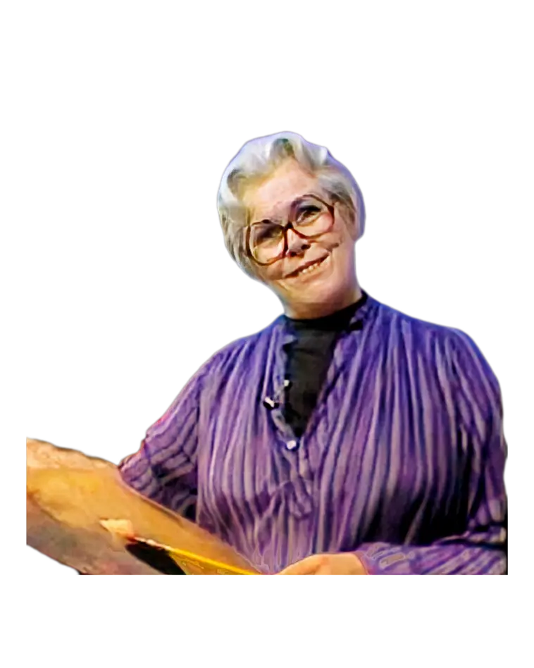
Learn Still Life Painting Class with Helen Van Wyk
This two-hour video lesson is perfect for artists at any level. Helen Van Wyk teaches step-by-step how to paint a still life, sharing techniques you can use in all kinds of paintings. For the best learning experience, grab these helpful resources:
MODEL: Model.jpg
FINAL: Final.jpg
LEAFLET: Leaflet.pdf
DOWNLOAD: https://drive.google.com/drive/folders/1EtXBGEyg-KitpWyiXh9vcnN6wp0A4K-8
These materials will help you follow along and improve your painting skills.
In this easy-to-follow lesson, Helen starts with a simple underpainting. She explains everything from setting up your composition to adding details like highlights and textures. You’ll learn about:
- How to paint realistic surfaces like glass, metal, and fruit.
- Adding depth and dimension with glazing techniques.
- Using wet-on-wet (alla prima) painting for final touches.
Helen’s still life setup includes a jug, a green glass bottle, a copper pitcher, apples, lemons, grapes, and a white tablecloth. Each item teaches a different skill, so you’ll know how to paint any subject with confidence.
Helen believed the basics are key to creating great art. By focusing on simple techniques, she helped thousands of artists improve. Now you can do the same!
0:00:00 Music and Intro Graphics
0:00:43 Components of a Painting
0:02:40 Arranging the Composition
0:12:01 The Tonal Underpainting
0:25:28 Stage 1 Review
0:26:22 Adding Background Color Graze
0:29:59 Adding Color to the Jug
0:38:53 Adding Color to the Bottle
0:46:52 Adding Color to the Grapes
0:52:25 Intermission + Helen Tips
0:57:26 Adding Color to the Apple
1:02:27 Analyzing Objects in Sections
1:04:35 Adding Color to the Copper Pot
1:15:46 Adding Color to the Lemons
1:22:11 Adding Color to the Table
1:27:41 Helen's Palette Explained
1:30:23 Adding Highlights and Brights
1:35:34 Bottle, Grapes, Apple, Pot, Lemon
1:52:09 Adding Color to the Table Top
1:54:35 Final Review
1:56:22 Final Thoughts and Thumbs Up 👍
1:56:50 Outtakes 🤗🫣
Subscribe now to learn painting tips and techniques with Helen Van Wyk. Get inspired to create your best art yet!
#stilllifepainting
#paintingforbeginners
#oilpaintingtechniques
#learnoilpainting #oilpaintingforbeginners
#oilpaintinglessons
#helenvanwyk
#oilpaintingteacher