This lesson is ready to play. Click the red play button to start.
Painting White on White: Techniques for Contrast and Depth with Helen Van Wyk
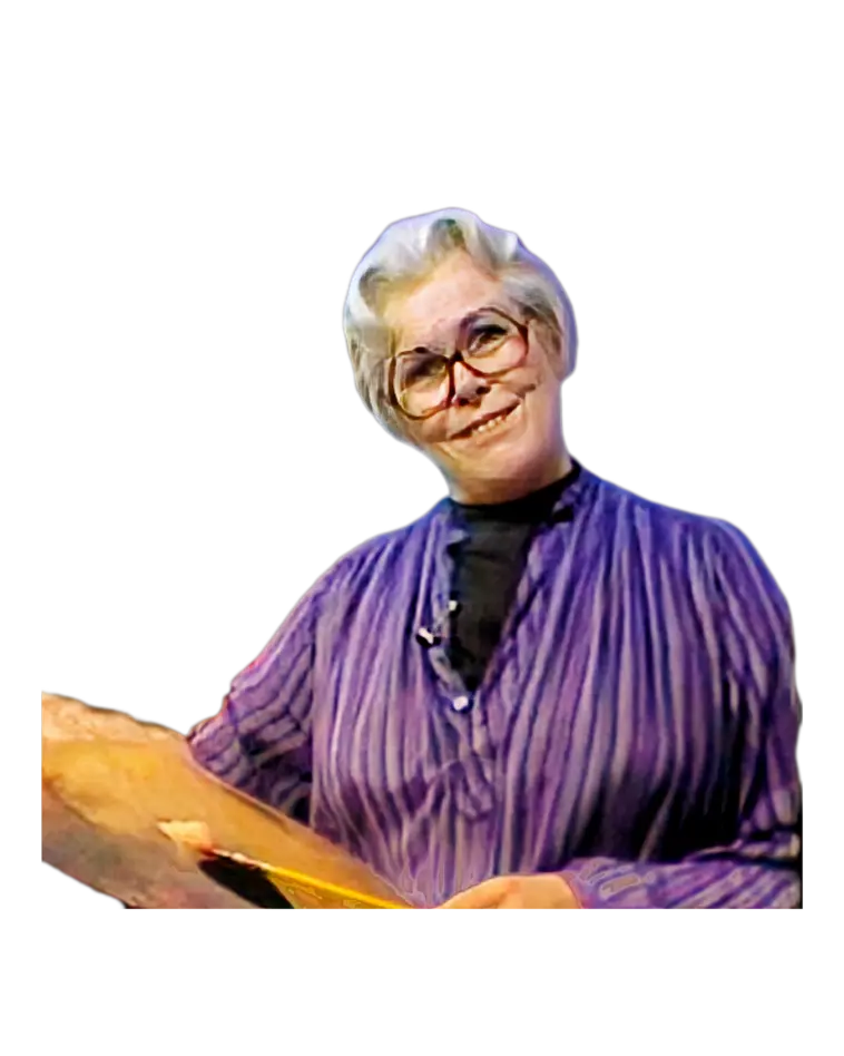
In this in-depth lesson, Helen Van Wyk explores the color white and demonstrates how to add richness and depth to an object that might initially seem one-dimensional. As she brings together elements like a white pitcher, eggshells, and a white table, Helen discusses the complexities of painting white and shows how a range of tones, contrasts, and complementary colors can reveal texture, shape, and even mood. This tutorial is more than a simple color study; it's a journey into the art of transforming white into something vibrant and captivating. Helen also provides insights into her unique approach, sharing foundational techniques that artists can apply to other colors and compositions.
Other videos mentioned in this lesson:
Ellipse: A Circle in Perspective
https://youtu.be/HpsAL4nd1eo
5S+5T=DR: The 5 Tone Values
https://youtu.be/XpgbBdi-MY0
Painting Drapery
https://youtu.be/UPSl-TduuhY
Hue, Tone, Intensity
https://youtu.be/KUK8s2_iEbM
In this lesson you will learn:
1. Introduction to White in Art
Helen introduces the focus on white, noting how it lacks the tonal distinctions we often assign to other colors. She reflects on her fascination with creating compositions featuring different shades and textures of white.
2. Setting Up the Composition
Helen explains her choice of subjects—a white pitcher, eggshells, and a tablecloth—and emphasizes the importance of careful placement to enhance contrast and composition in a white-on-white setting.
3. Understanding Perspective with Ellipses
As she sketches the initial shapes, Helen demonstrates how to tackle perspective distortions, particularly when creating ellipses. She shares her approach to sketching these challenging shapes to achieve a natural look.
4. Applying Complementary Colors and Shadows
Helen illustrates how using complementary colors, such as violet to balance green tones, enriches the shadows and adds dimension to white objects. Her unique perspective shows how subtle color choices create tonal variety in otherwise plain white surfaces.
5. Creating Light Against Dark for Depth
To prevent light objects from blending into the background, Helen explains the significance of placing light against dark. She highlights how consistent lighting is key to creating depth and realism in a composition.
6. Painting the Subtle Tones of Eggshells
Helen focuses on painting the eggshells, layering colors to differentiate the inside and outside tones. She uses yellowish and grayish whites to capture the subtle variations and thickness of the shell.
7. The Role of Reflected Light
Adding reflective highlights, Helen deepens the sense of realism, explaining how reflected light affects the shading and dimensionality of white objects, especially in creating the illusion of form.
8. The Five Tone Values Explained
Helen concludes with her signature five-tone approach—highlight, body tone, body shadow, cast shadow, and reflection—explaining how these tones work together to bring depth to any object, especially when using limited colors like white.
9. Closing Remarks: Next Lesson on Drapery
Helen teases her upcoming lesson on using tone values to paint drapery, humorously mentioning her ongoing promise to make soup—a warm sign-off that characterizes her approachable teaching style.
Technique Explanation:
At the beginning of the lesson, Helen uses a greenish undertone on both the background and the pitcher. This initial green provides a unique advantage: it allows her to use the color violet to form the shadow on the pitcher. By using violet instead of a neutral gray, she adds richness and depth to the shadow area that would be difficult to achieve with gray alone. Near the end of the demonstration, Helen revisits this green base on the pitcher, subtly blending and adjusting it with white to create a soft, fused appearance. This final layer brings together the pale green and white, adding a delicate, natural white finish to the piece while preserving the dimensional effect she established from the outset.
Dive into the world of oil painting alongside this legendary artist and instructor, Helen Van Wyk. Discover invaluable tips, techniques, and inspiration as Helen shares her wealth of knowledge. Whether you're a beginner or a seasoned artist, Helen's timeless wisdom and contagious enthusiasm will ignite your creativity and elevate your art to new heights.
Helen took the time to teach us the principles and reasons behind painting each element in the progression of a work. Her sensibility in basic natural fundamentals taught us we can paint anything by employing these basics. Subject matter was a minor consequence to Helen. Using the basics, thousands of artists received the confidence to paint any type of subject.
Subscribe now and embark on an unforgettable journey of artistic discovery with Helen Van Wyk!
#oilpaintingforbeginners
#oilpaintingteacher
#oilpaintingtechniques #oilpaintingforbeginners
#oilpaintinglessons
#helenvanwyk
#oilpaintingteacher