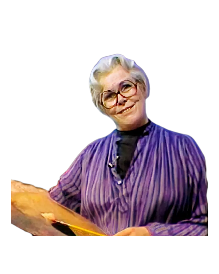
Hello, I'm Helen Van Wyk, and welcome to my studio. In answer to the question, "What do I mix to
get?" I'm going to try to explain how to mix the colors. To do so, I'm going to recreate a picture
similar to this. It's going to have kind of this color background, and it's going to be a lettuce
and lemons.
But before I do, let me show you my palette of colors and tell you why I have it arranged this way. I
have white to lighten the color, black to make gray when mixed with white, or black to use to darken
a color further if I want it that much darker. There are six colors of the spectrum: yellow, orange,
and red; yellow, orange, and red. They're the warm ones. I have to have more versions of one. Nature
can use one. I need more than one of each to get the full range of the warm colors. So, I have
yellow, orange, and red grouped here in a bright version. Yellow, orange, and red again, and yellow,
orange, and red again. They vary because these are light and bright, these are duller and darker,
and these are darker yet and darker duller too. Then I have the cold colors: violet, two versions;
blue, two versions; one version; and green, two versions. I can get a tremendous variation of light
out of these colors by mixing them with white. I don't have to get them brighter; they're bright as
they are. My main problem in working with these colors is to get them less bright, and so I do that
by mixing a tone of gray and mixing these colors in it. These cool colors are grayed down or dulled
by mixing into gray, and so that's why I have the palette arranged this way: bright, medium, and
dull warm colors; dark but brilliant cool colors that I can vary by making them light and bright
with white or make them lighter and duller by mixing them into gray. Now, those are the three
properties of color: the **hue**, the **tone**, and the **intensity**. These are the questions I ask
myself before I start to actually aim to a mixture. So, here's my palette. Let's consider the color
of the background for this picture.
It has to be one of the six: yellow, orange, or red; violet, blue, or green. I can't call it rust
because rust is not a color of the spectrum. It's a version of orange, more orange than anything
else. Now, what one is it close to? It's not a bright orange; it has to be a duller orange, so
probably into this duller warm group. Burnt sienna would be closer to that than this. Don't have a
preconceived idea of color. Don't say that orange is only the color of a tangerine, and a lemon
yellow is only the color of a lemon. Each color can vary in tone and intensity from very light to
very dark, from very bright to very dull. So, let's see how this works. Yes, it works fine just as
it is. Why? People always ask me why. It's because I'm putting it on the tone of that background
color, and so this application will satisfy this because this is what is known as a glaze of color.
I have established the tone of the color first with gray and put the color over it. I thought I'd do
it this way so that I could talk a little bit, too, about the two ways to paint color with oil. You
either can put it on transparently over a gray that is compatible with the color you want, or you
can be direct. So, let's take a brush and smooth that out just for fun.
Now, if I were going to paint that color on a white canvas, I would have to take white and black, mix
the tone of the color, and then add the burnt umber or burnt sienna into it, which is a little bit
more—oh, I didn't put out enough—is a little bit more difficult. So, if I don't have enough burnt
sienna, I can take burnt umber and then put some of the cadmium orange in it to make it measure up,
and so we come a little bit closer to that. Oh, wow! Ha! Isn't that nice? I hit it right on the
nose. So now, let's consider the color of the lettuce. It's light; that means I need white. It's a
yellowish green. I have a yellowish green here, yellow, and a bright green. I have a darker green
over here. I have these yellows here. So I ask myself, is this yellowish green light and bright, or
light and dull? I think it's light and bright. So, why don't I take white and this phthalo yellow
green and see if this is all right? Ooh, it's a little bit too bright. It's too light. I need a
darker green into it. Oh, that's better. So, let me paint this in where I see the darker green
leaves of the lettuce. Now we have to put in this where the lettuce seems to be lighter—more white,
more green—and it looked yellower. So, some more yellow in it. That's fine. And with a clean brush,
the color of the very light part of the lettuce—well, it can't be called white; it's a yellowish
white, very faint. So, I have to have white and some yellow in it. Maybe if I put this yellow in it,
it's going to be too yellowish. A duller yellow might make it work. So, I'll take this dull yellow.
Yes, maybe a little bit more colorful than that. The rusty end is in the orange family again, dull
orange, not bright orange, but maybe brighter than that. So, a brighter orange into it. Fine.
Today's session is mostly about hitting the right mass tone color. I talk so much about the shadow
color, yes, I have to employ the complementary, but let's keep our mind on just mixing the right
mass tone colors. So, let me get away with shadows—just with gray. You know, you really can almost
paint every shadow by making it gray first.
And what about the color of the onion? Do I have onion color? No, just the colors of the spectrum. I
look at it and I say, is it yellow, orange, or red; violet, blue, or green? I think it's violet, a
violety red. Now, alizarin crimson is a violet on the palette. It's not a red; it's definitely
violet. Watch when I take alizarin crimson and mix it with black and white—you'll see that it's
definitely a violet. But I said that it was a violety red, and so here I have mixed that, and let me
see if that's close. No, to me this is too violet. It needs to be violety red. So, violet plus
red—that's got more spark. The mass tone color is the beginning of a good color presentation. Let's
consider the color on the green pepper. Is it the same color as the lettuce? Yes, it's the same
color; it's still green. But what version is it? It's darker. So, instead of using this green, I
take the darker green, sap green. Mix it. Try it. Too dark, too dark and not bright enough. So I can
lighten it and brighten it with the lighter yellow and see if this will work. It's still lighter.
Oh, fine. Ask yourself four questions: What color do I see? What tone is the color? What intensity
is the color? And what is the peculiar hue of the color? So, if you're going to feel more confident
about mixing color, ask yourself these four questions before you even aim to your palette. Say, what
color do I see? Yellow, orange, or red; violet, blue, or green? Relegate every color you see as one
of the six colors of the spectrum. What color is flesh? It's not flesh color. You can't really buy
flesh color in a tube, although there is one, but it only applies to one person's flesh color. So
you have to say flesh is orange, and then aim to some of the oranges on your palette to see if you
can come close to that particular flesh color you're looking at. What about the lemon? The meat of
the lemon is certainly a different color than the skin of the lemon. What makes it different? First,
it's darker, and it's duller. So, let's make the skin of the lemon first, which is rather an easy
yellow to make—white and yellow. And the meat of the lemon, a color that so many people just can't
figure out. Well, it's yellow, darker and duller than this. What's a darker dull yellow than this?
This group right in here, raw sienna, maybe brightened. Let's try that one. Yes. So, you conclude by
asking yourself the questions: What color do I see? What tone is the color? What intensity is the
color? And what is the peculiar hue of the color? This yellow doesn't seem to be green enough, and
so going back to yellow, put a little green in it to get the hue, just the right hue of yellow. The
three properties of color: hue, tone, and intensity. Painting seems to be haunted by threes. And
I've tried to set this down very, very simply, and you can see that I am making a paint record of
the colors over there. And now let me put in the off-white of the table. Well, it looks so different
than this white. Just compare the two—this looks bluish in relation to this. So why don't we try
that? Let's take white and an ever-so-little bit of blue, and that makes a difference. Subtle, yes,
but such a simple presentation of the colors of these things. So, let me go back to the background,
the lettuce, and each thing to work with the color and describe what I'm mixing as I go. What I'm
mixing is the shadow color to impart some dimension. Remember, the background was burnt
sienna—pretty much plain burnt sienna. Here I have burnt sienna again. To make the shadow, you can
take the mass tone color and add into it its complement. Blue is complementary to orange because
burnt sienna is an orange, and I'm going to darken and make a shadow here, a cast shadow from the
lettuce onto the background. Extend it all the way out—I like it out all the way out. And to put a
darker tone where the light's coming from helps to make the light look as though it's going to the
left from the right, just as I did in the painting that you saw at the beginning of my lesson. The
background is a lighter, brighter orange right in through here where the light is going. So, I need
a lighter, brighter orange than burnt sienna. Why don't I take burnt sienna first plus a lighter,
brighter orange, cadmium orange, and see what that will do to here? Everyone worries about mud,
muddy color—it's a beautiful color in a lousy place. But one thing that can muddy your color more
than anything else is a brush that is not clean. I have a lot of turpentine that I keep my brush
clean in and these little rags so that I can constantly wipe away. It almost looks automatic, but
you don't notice. I quickly clean that brush, wipe it off, wipe it here, to go on to the next. So
now, I need some shadow. Shadows on the lettuce—green, a darker version of what I used, plus its
complement, a violety red, because it's a yellowish green. And we see a shadow here, shadow here,
and that leaf is in shadow. Clean the brush—really wiggle it around. Have a half a canful. And this
leaf of lettuce, very light, is rolled up in front. Lighter, brighter yellowish greens seem to be
rippling along the little fluted edge. I love to paint lettuce. It's like a flower. And then there's
shadows—gray, gray-violet on the off-white part. Oh, here's a green leaf coming in front. So many
people say you can't use pure white. No, you really shouldn't. I do sometimes; I just don't tell. I
feel as though I can get away with it when I need to. The rules are only learned so you can break
them. If you paint by the rules, you end up too rigid. But if you know the rules and break them, you
know just how far you can push them. Now, if I put pure white on here, I might be able to get away
with the fact that it's blending in with some of the light I had. But I found out that really, I
maybe started that light part too light, so lighter light didn't even show. Oh, maybe this little
shadow will help. The highlight on the red onion seems to need a lighter, brighter version of what I
already have. Remember, I had alizarin crimson and Grumbacher red. Now I'm going to take white,
Grumbacher red, and alizarin and see what that does to it—lighter. Get more alizarin crimson with a
touch of green, its complement, to darken it into shadow. Yes, the shadow was made by taking a
darker version of the mass tone color and adding its complement. It's not just adding the
complement; it's adding the complement into a darker version of the color. And now, on the green
pepper, I see lighter versions, lighter, brighter greens—phthalo yellow-green again into white. I
see it here, here, here. Maybe that green is a little bluer—a bluer hue of green than I have. Taking
a little, just a little bit of phthalo yellow, phthalo green. Phthalo colors are strong; you don't
need much of them. They'll go a long way. Better to start out with brilliant colors—you can always
get them duller. You can't make a dull color brilliant, though, unless you have a brilliant one to
brilliantize it. In telling you how to mix the right color, I didn't go about doing this the way I
usually go do it, but it fits. It works with the rest of the personality of the picture. And
shadows—when in doubt, use gray. Gray is the common complement to every color. It takes on a look
because it has no definition of its own. The color you put it next to tells it what color to be.
Color mixing is not the only answer to a lovely picture. It's many D's: dedication, determination,
desire. I know patience doesn't start with a D, but you need that too. So maybe this program has
answered some of your color questions: "What do I mix to get?" And next time we meet, I'm going to
paint silver and add some red roses. Or maybe I'll just teach you how to make soup. Hi, my name is
Helen Van Wyk, and welcome to my studio.